


Tilda
Brand Identity for a Modern Multi-Vitamin Supplement Range
Brand Identity for a Modern Multi-Vitamin Supplement Range
Tilda is a self-initiated branding project for a contemporary multi-vitamin supplement range. The identity repositions supplements as part of a modern lifestyle, designed to feel uplifting, approachable, and emotionally engaging.
The project explores brand identity, logo design, packaging, and visual storytelling across product applications.
Tilda
Brand Identity for a Modern Multi-Vitamin Supplement Range
Tilda is a self-initiated branding project for a contemporary multi-vitamin supplement range. The identity repositions supplements as part of a modern lifestyle, designed to feel uplifting, approachable, and emotionally engaging.
The project explores brand identity, logo design, packaging, and visual storytelling across product applications.
Objective
Objective
Creating A Playful Yet Trustworthy Wellness Brand Identity
Creating A Playful Yet Trustworthy Wellness Brand Identity
The aim of this project was to develop a distinctive identity for a multi-vitamin range that stands apart from traditional clinical wellness branding.
The brand targets people who are health-conscious but drawn to more expressive, design-led products. The objective was to strike a balance between credibility and warmth, creating a system that feels positive, accessible, and part of everyday life.
Rather than communicating supplements as a medical necessity, the brand positions them as a supportive lifestyle habit that contributes to energy, wellbeing, and daily ritual.
The aim of this project was to develop a quirky identity for a multi-vitamin range that stands apart from traditional clinical wellness branding.
The brand targets people who are health-conscious but drawn to more expressive, design-led products. The objective was to strike a balance between credibility and warmth, creating a system that feels positive, accessible, and part of everyday life.
Rather than communicating supplements as a medical necessity, the brand positions them as a supportive lifestyle habit that contributes to energy, wellbeing, and daily ritual.

Logo Design


Concept & Direction
The Tilda logo mark was designed to reflect a modern, organic identity system with a soft structural foundation.
Symbol & Meaning
The symbol avoids literal botanical references, instead using abstracted plant-inspired forms to create a flexible visual language suitable for a wider product range.
Composition
The mark is constructed within a rounded square framework, combining organic curves with a controlled geometric base. This balance supports clarity and scalability across packaging and digital applications.
Final Expression
Heavier forms at the base of the symbol provide visual grounding, while internal spacing between elements maintains legibility. The result is a logo that feels structured, adaptable, and naturally expressive.
Heavier leaves/forms at the base of the symbol provide visual grounding, while internal spacing between elements maintains legibility. The result is a logo that feels structured, adaptable, and naturally expressive.


Creative Direction
Brand Voice And
Visual Storytelling
Brand Voice And
Visual Storytelling
Brand Voice And
Visual Storytelling
The visual language draws inspiration from contemporary lifestyle and wellness brands such as Evo Haircare and This Works, combining personality-led storytelling with functional clarity.
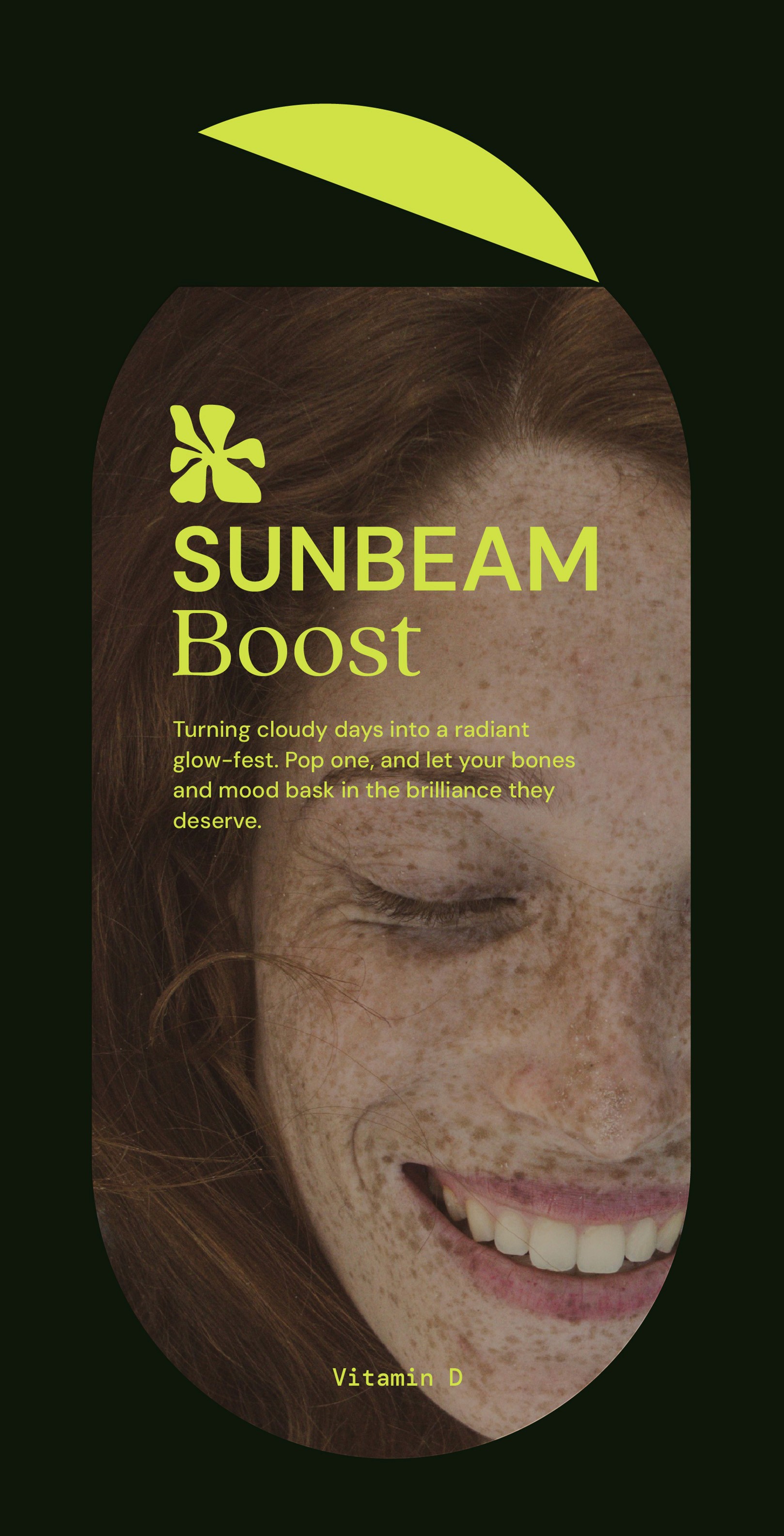
The system aims to feel optimistic and expressive while remaining grounded and trustworthy. Design cues such as pill-shaped framing devices subtly reference capsule forms, helping reinforce the product category without relying on clinical aesthetics.
The visual language draws inspiration from contemporary lifestyle and wellness brands such as Evo Haircare and This Works, combining personality-led storytelling with functional clarity.
The system aims to feel optimistic and expressive while remaining grounded and trustworthy. Design cues such as pill-shaped framing devices subtly reference capsule forms, helping reinforce the product category without relying on clinical aesthetics.